
Techaid
A Service Design and Product Design Project
This project was curated during my second year of Design Computing Bachelors Degree, through the subject Interaction Design Studio (DECO2200). I was a group project consisting of myself and two other students. I have a reference letter from the Unit Coordinator, Hamish Henderson, which is available upon request.
Techaid:
November, 2019
As the Australian population ages, the number of people admitted to hospitals grows whilst the resources, the number of employees and funding have plateaued. The current system is underdeveloped and is struggling to cope with the increasing demand for hospital resources. Techaid was an innovative project aimed at improving the hospital patients experience whilst in the waiting room. To achieve this , Techaid uncovered the systematic problems that are in place in every emergency room and the problems this can subsequently cause for patients.

The Problem
Our target users included patients who were triaged into categories 4 or 5, as they are the lowest priority categories and therefore experience the longest waiting times. We are specifically targeting those who are Australian citizens and aged between 18-55.
Insights
The main insights and problems with patients’ current experiences in the emergency department, as discovered during our research phase, include the following. However the most fundamental problems that are severely decreasing patients’ experiences where:
Lack of communication from staff
No support for distress
Unenjoyable and undefined wait times
Lack of education about the Emergency Department

Concepts

Interactive Wristband
This concept provides visual feedback to users about their waiting time though coloured lights. The wristband is connected via bluetooth to a screen to prompt the user with stress relieving activities, such as games or breathing exercises, when the wearer's heart rate increases.

Veggie Patch
This concept consists of a projected vegetable patch in an emergency room, which shows live feedback about patients' waiting times in a visual display. Each patient can choose their veggie type and their wait time is represented through the maturity of their veggie.

Early-Check-In App
Patients would be required to download this app on a smart device Upon attaining a minor injury or condition, patients can check-in to an ED and will be provided with an ETA and countdown to leave.The app would provide the ability to fill out necessary forms and basic first aid while the patient is waiting to leave.
Chosen Concept
Through further iterations and development we created Flower Patch, based off the Veggie Patch concept. This was sone so as Techaid wanted to avoid the negative connotations associated with the word “vegetable” and also create a less childish appearance to suit our target audience. Following received feedback to make our app more comprehensive, we included some features from our other concepts. This includes allowing the patient to review and check their medical details (from the interactive wristband) and educate themselves more about the emergency department and first aid (from the early check in). Techaid wanted to incorporate gamification as it wouldl not only allow the creation of an engaging and enjoyable waiting experience but also educate users and encourage them in future to seek more appropriate methods of treatment, such as visiting a General Practitioner.

User Journey Map


Iterations
Our usability testing plan consisted of participants tested will be based on our target market of 18 - 55 year olds, who have visited the emergency room as a patient or primary carer at least once in the last 10 years. In each round of testing our selected participants engaged in moderated usability testing, where the goal or task was defined for the user to complete using our prototype, and a “Think Aloud Protocol”, where the participants will explain and reveal their emotions as they interact with the product.
The moderated usability testing will follow the structure for Abstract and Concrete Tasks. The first step is to define ‘Abstract’ tasks, which are high-level outcomes of what we want the user to achieve. Following this, 2-4 ‘Concrete’ tasks for each ‘Abstract’ task, which are individual instructions that will iteratively increase in depth and difficulty, will be defined. By defining realistic tasks for users to complete we can gained qualitative insights into what is causing users to have trouble and hence improve the usability of our designs.
Iteration 1

The first round of testing consisted of a low-fidelity, sketched paper mock-ups, which will allow us to gain feedback on the usability of the design before large amounts of effort and time are placed into designing the smaller, more detailed features involved with higher fidelity mock-ups.
We were very satisfied with this round of testing as a starting point for our app. The response was positive, with many users excited by the concept. However, our user testing also gave us some valuable criticism and feedback, resulting in the identification of areas of improvement to increase the usability of our app as the moderate and complex rated tasks there was still some difficulty for the users.
Iteration 2

This mid fidelity prototype produced great results closer to the original target we first set out of ensuring all easy and moderate tasks were completed quickly with no issues and all difficult tasks were completed in a reasonable amount of time. We identified a few minor issues mostly in accessibility that need to be changed in order for the app to be completely usable and enjoyable that we will implement into the final design.
Iteration 3

Users were asked to use the app prototype to complete 4 tasks:
Complete the walkthrough
Login to the app
Unlock a new Customise your flower
Add a peanut allergy to your profile
They were then asked to complete the heuristic evaluation chart below. Users could ask assistance if needed when engaging with the app prototype or completing the chart if further explanation was required of the heuristics.


Final High-Fidelity Product
Promotional Video
App Walkthrough Film
Watch this video to see the app in use

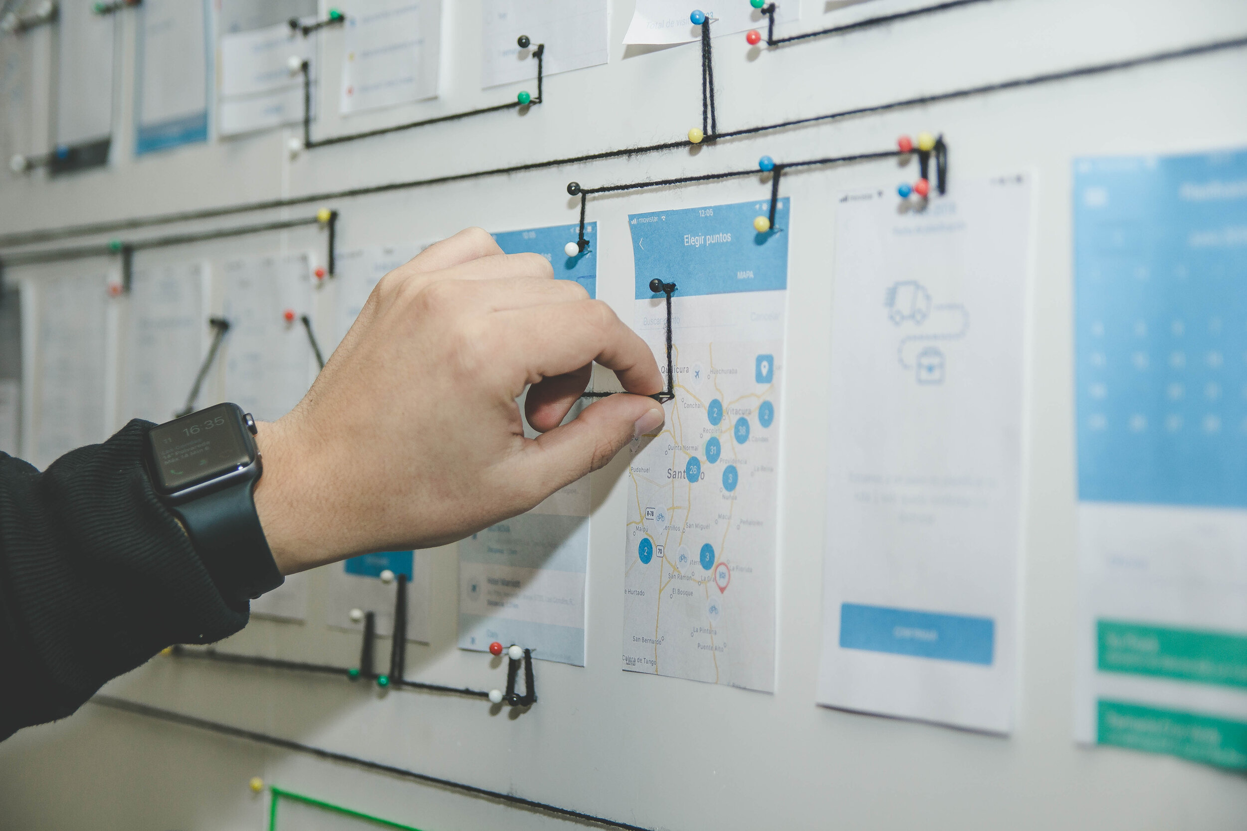
This is a wire flow of the final product produced. Through over 20 hours of interviews, over 100 survey respondents and 4 iterations. Techaid is extremely proud of the product we produced to revolutionise NSW emergency waiting rooms for patients.